3
Workstreams
4D Menu, iTranslate, and Project Ears carried the clearest examples of the work.
Bragi / 2017-2018
Case study
Helping people understand advanced earbud behavior through clearer interaction logic, onboarding, and product validation.
Overview
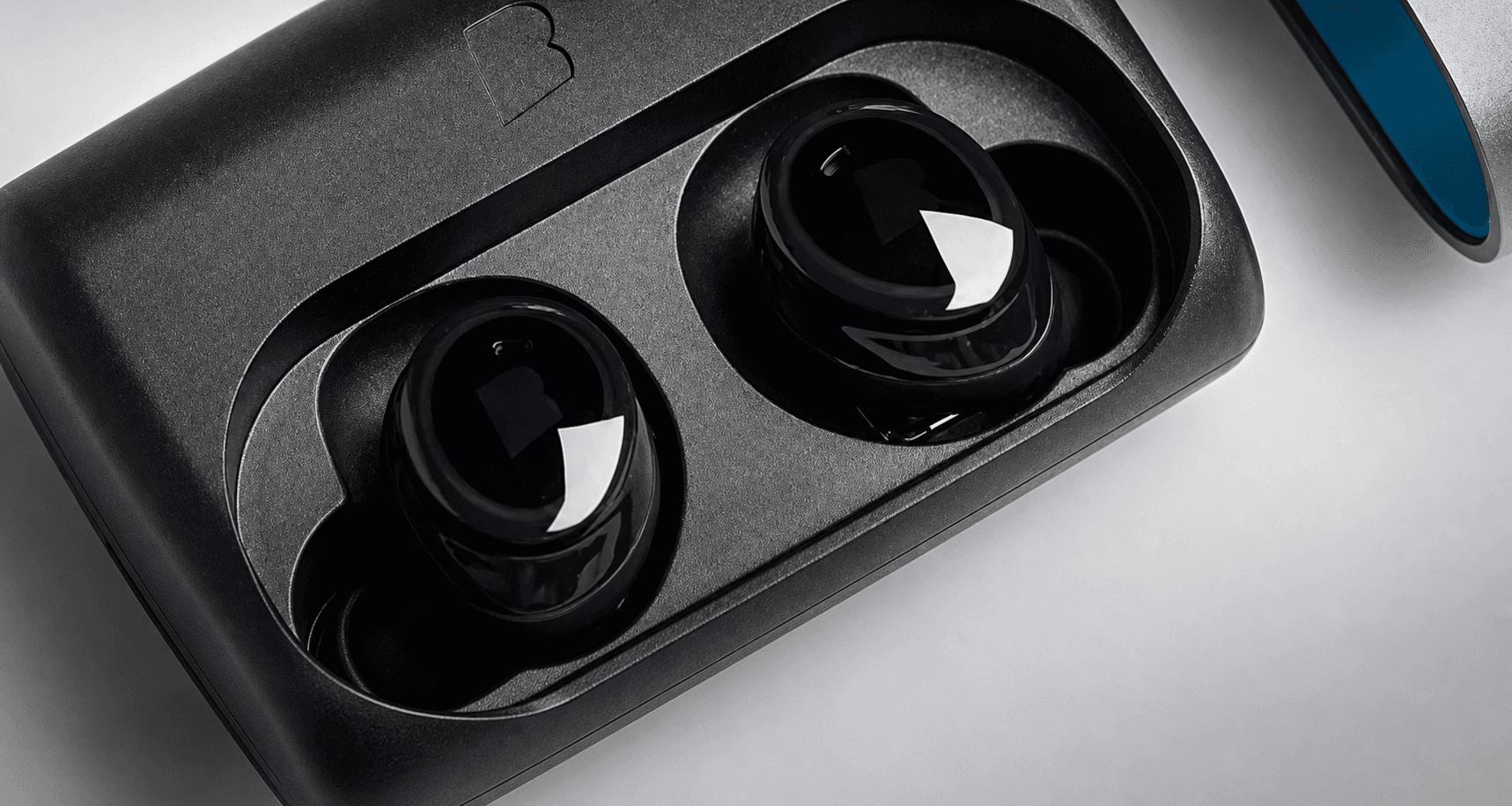
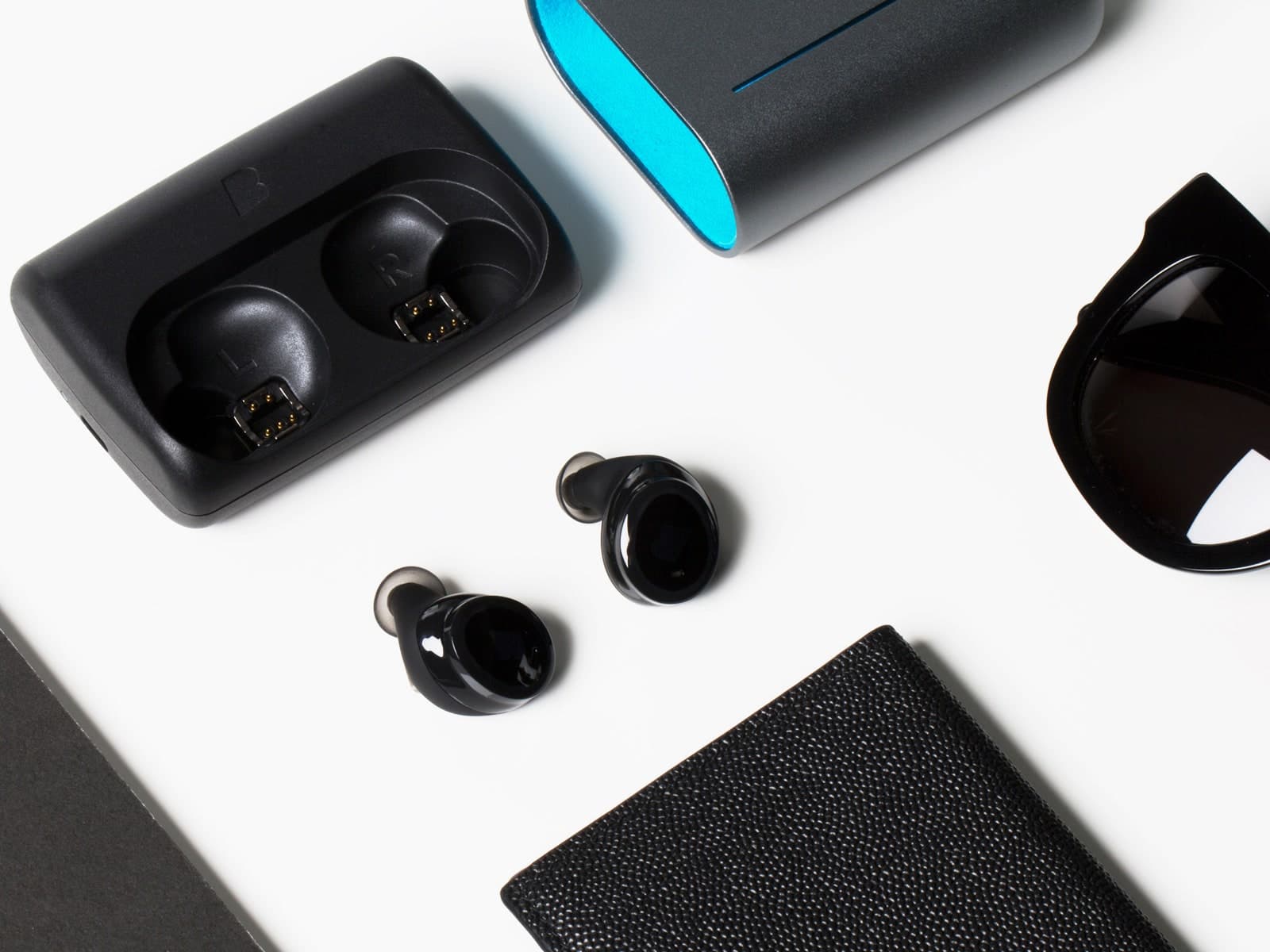
The work centered on Bragi's hearables: a hardware-software product where feature behavior, onboarding, QA, and production constraints all affected the user experience.
At Bragi, design could not depend on visible navigation, generous screen space, or stable platform conventions. Many product decisions had to be understood through gestures, audio feedback, companion-app setup, device states, and the way the earbuds behaved in real use.
That made the contribution less about polishing isolated screens and more about making advanced features easier to learn, test, and ship. The work had to stay close to product definition, implementation behavior, and QA findings because those were often where the real UX problems appeared.
At a glance
3
Workstreams
4D Menu, iTranslate, and Project Ears carried the clearest examples of the work.
3
Roles
Lead designer, support designer, and quality control depending on the project.
1
System
Hardware behavior, software states, onboarding, and QA had to work as one experience.
Contributions
Led design work across concept development, interaction design, onboarding logic, testing support, and production-aware refinement.
My role moved between screenless interaction models, service flows, onboarding logic, testing support, planning, and production-facing follow-through depending on what the feature needed.
Some projects required concept ownership and onboarding logic. Others required QA-connected refinement: structured test coverage, issue synthesis, and a clearer connection between device behavior, firmware behavior, companion-app flows, and third-party services.
The three featured workstreams were different in shape, but they shared the same product-design pattern: make constrained behavior easier to understand, validate, and ship without pretending the constraints or production support were outside the design problem.
Three connected use cases
Three projects show how the work changed as the product problem changed.
4D Menu focused on discoverability without a screen. iTranslate depended on a coherent flow across device, app, and service. Project Ears needed a guided experience people could trust. Each project asked for a different kind of clarity under hardware and software constraints.
Interaction model
Making advanced functionality understandable without a visible menu.
Service flow
Making a technically ambitious feature feel believable across touchpoints.
Concept + onboarding
Turning hearing health into a trustworthy screenless journey.
Interaction model
Making advanced functionality understandable without a visible menu.
This was not a standard interface layered onto a familiar screen. The work was about translating advanced functionality into something people could discover, learn, and trust through head movement, audio cues, and device feedback.
That put the emphasis on structure, active state, exit behavior, and expectation-setting. The design problem was not only how the feature worked, but how quickly it became legible enough that people could use it with confidence.
What I shaped
Interaction behavior, discoverability, active-state clarity, and the learning path into a nonstandard feature model.
What it demonstrates
Comfort with products where clarity depends on system logic, feedback, and onboarding rather than visible UI alone.
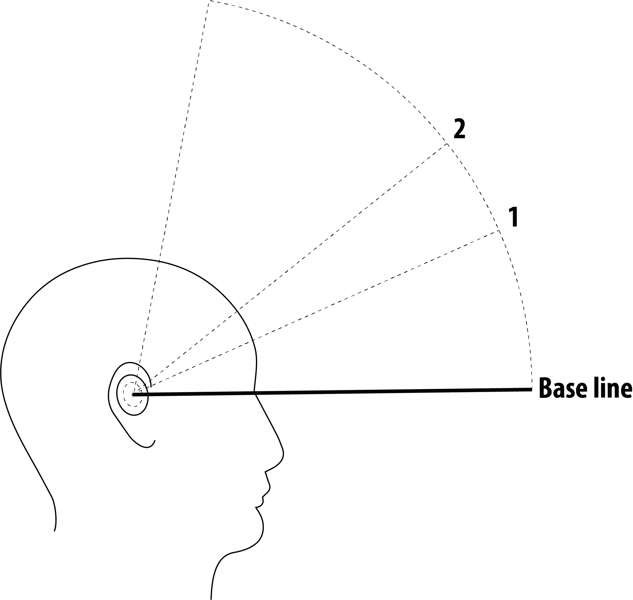
Entry
The first problem was finding a gesture stable enough to open the menu without false triggers during walking, exercise, or ordinary head movement.
Navigation
We compared horizontal and vertical structures, then found that motion and environmental drift could make selection unreliable unless the active state stayed legible.
Interaction logic
Static vectors and rapid audio cues created overload, so the design shifted toward dynamic vectors with overlap buffers to smooth transitions and reduce processing strain.
Exit + context
Selecting had to coexist with a clean exit path, and the feature set had to adapt depending on whether the earbuds were connected to the phone or operating offline.
After release
Testing also exposed social and safety issues: some users felt awkward using head gestures in public, and others misread the feature as something suited for driving.
Service flow
Making a technically ambitious feature feel believable across touchpoints.
The feature itself was compelling, but the real design work sat around the system boundary. Firmware behavior, app setup, third-party API behavior, and user expectations had to align closely enough that the feature felt understandable rather than fragile.
That made the work less about adding one more capability and more about shaping a complete service flow inside a hardware product. The visible and invisible parts of the experience had to support the same promise.
What I shaped
Multi-touchpoint flow design, expectation-setting, structured testing, and feature coherence across device and companion app.
What it demonstrates
Ability to design service-like logic inside a hardware product where the flow matters as much as the feature itself.

System boundary
The experience depended on Dash Pro firmware, the companion app, and the iTranslate API behaving as one system, not three separate layers.
Expectation gap
When the earbuds took longer to acknowledge input than users expected, people often retried immediately, creating loops of repeated commands and contradictory feedback.
Conversation mode
The hardest cases appeared when two Dash Pro plus iTranslate setups had to work together, because pairing two pairs introduced latency, handoff, and audio-routing failure modes.
My role
I helped build the end-to-end test protocol, prepared the test kits, distributed software builds, documented pass or fail outcomes, and fed UX improvements back into the project.
Concept + onboarding
Turning hearing health into a trustworthy screenless journey.
This work moved beyond feature polish into a more ambitious product idea. The experience had to help people complete a hearing-related flow with confidence even though it could not depend on Bluetooth or a full-screen guided experience.
That raised the bar for onboarding, pacing, and trust. It also made the work feel closer to product architecture than isolated feature design, because the concept only succeeded if the full journey felt understandable and safe enough to follow.
What I shaped
Journey mapping, onboarding logic, voice-guided interaction flow, training mode, and iterative improvements to the core test experience.
What it demonstrates
Strength in translating complex ideas into clearer end-to-end experiences, especially where trust and learnability matter.
Constraint reset
The concept had to run without Bluetooth in hearing-aid mode to preserve battery life, which forced the hearing test and onboarding logic onto the earbuds themselves.
First compromise
A direct translation of the multi-frequency mobile assessment broke down because left and right earbud coordination was unstable, so the test was split into separate left-ear and right-ear sessions.
Training mode
Early tests showed first-time users struggled with both the hearing task and the device controls, which led to a dedicated in-device training step before the actual assessment.

Gesture revision
Users distrusted the accuracy of tap-based responses when their input felt late, so the interaction changed to press-and-hold before each tone, then release on detection.
Trust recovery
To avoid encouraging endless retakes while still supporting genuine failures, I helped shape a guided redo function with validation logic and revised voice prompts.
Expansion path
The project later expanded into tinnitus relief, age-based hearing support, and adaptive hearing protection, which pushed the concept beyond a single hearing test into a broader product platform.
What connected the work
The projects were different, but they exposed the same kind of product-design problem.
01
There was almost no visible interface to rely on, so discoverability and feedback had to come from behavior instead of screen patterns.
02
Firmware behavior, the companion app, and third-party integrations had to feel coherent enough that advanced features stayed believable.
03
Some flows were sensitive enough that onboarding, pacing, and redo logic mattered as much as the feature itself.
Impact
What it proved
The work made a constrained product easier to understand, test, and ship with confidence.
Impact read
5
4D menu questions
Entry, navigation, active state, exit behavior, and context-aware feature sets all needed clear decisions.
2
Primary touchpoints
Earbuds and companion app had to behave like one product, not parallel layers.
3
Design strengths
Ambiguity handling, systems thinking, and shipping discipline shaped the work from concept through delivery.
Learnings
The lesson was simple: when the product is complex, the designer's job is not just to make it look resolved. It is to make the system easier to understand, easier to learn, and easier to ship with confidence.
Working as a product team
Quality issues often exposed product-model issues because they showed where feature behavior, state logic, or user expectations were unclear.
Working with constraints
The more constrained the environment, the more important it became to connect concept thinking with implementation, validation reality, and production support.
Long-term relevance
This chapter set the pattern for later work: clarity under constraint, not clarity in ideal conditions.
This chapter matters because it shows that the later work in embedded HMI, charging and service ecosystems, and enterprise systems did not come from nowhere. The core pattern was already there: structure ambiguity early, make behavior clearer, and stay close to the realities that determine whether a product actually works.
Career sequence
You are on chapter 4 of 4. Continue through the sequence for the clearest career story.
Newer chapter
Lead proofEmbedded HMI rigor
Embedded HMI across cluster and infotainment where precision, consistency, and technical constraints had to move together.
Automotive interface work spanning graphical production, prototypes, icon systems, and shared interaction logic for truck HMI surfaces.
Earlier chapter
This is the earliest chapter in the sequence. Return to the work index if you want to compare the broader arc from the most recent experience downward.